New Eurovision logo for 70th anniversary divides the internet

Eurovision 2025 winner JJ. (Corinne Cumming/EBU)
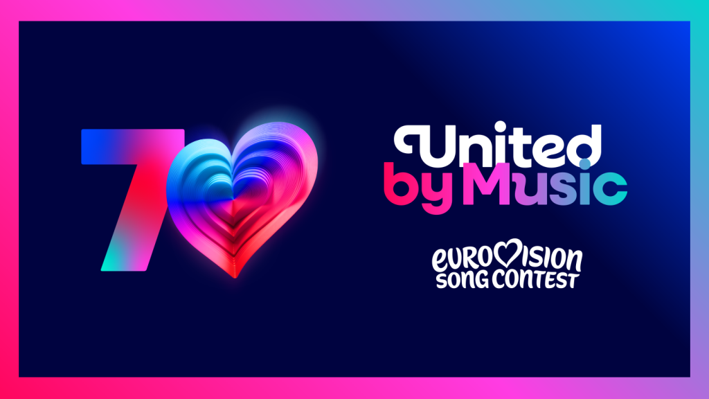
The Eurovision Song Contest has unveiled a new logo for its 70th anniversary, and it’s safe to say, the internet is pretty divided.
Believe it or not, it was almost 70 years ago that Eurovision first graced our screens. The inaugural song contest consisted of just seven nations competing: the Netherlands, Switzerland, Belgium, Germany, France, Luxembourg, and Italy.
As per the official site, Austria and Denmark wanted to join in the musical festivities but missed the deadline, while the UK “sent their apologies” for their lack of attendance.
In light of the plethora of eclectic performances, unabashed LGBTQ+ support and enough ambitious key changes to shake a stick at over the years, Eurovision has decided to celebrate that “with a fresh new look”.
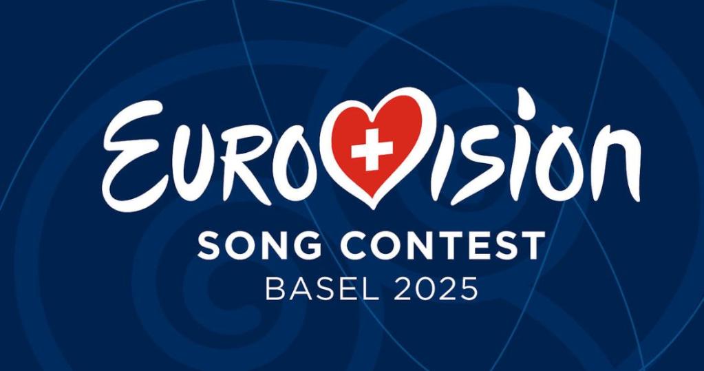
The TV programme took to Instagram to reveal the 70th anniversary logo for Eurovision 2026, and also shared the theme for the anniversary, “United by Music”. Rather than its iconic hand-drawn script, launched in 2004 and refreshed in 2014, it has shifted to an all-lowercase, rounded font.
It features a heart at its centre in place of Eurovision’s “v”, “which is now beating louder than ever,” a press release explained. For the 70th anniversary, the “0” features what’s been dubbed the “Chameleon Heart”.
“The ‘70th’ heart manages to incorporate 70 layers; one for every year of the Eurovision Song Contest,” the statement added. “Each layer represents one year of bringing song, sparkle and unforgettable moments to audiences across Europe and now the world.”
Despite the sentiments behind the changes, fans are pretty divided. “This is giving Canva/ AI and not in a good way,” wrote one.
“Undo it,” commented another.
“Not to be dramatic but you just ruined my week,” quipped a third.

“Being a Eurovision fan is so hard,” said a different viewer.
However, others stood by the logo change, with media page Eurovision Pulse writing: “Love it!”
“Looks good,” wrote another.
“Oddly…I don’t hate it,” added a third supporter.

Director of the show, Martin Green CBE, said via the press release: “The Eurovision Song Contest has always been about evolution – musical, cultural, and creative. This refresh honours 70 amazing years while taking the brand forward to an exciting future. It’s bold, playful, and full of heart – just like the Contest itself. We’re so proud to unveil it to the world.
“Our new logo and look have been designed to make the ESC brand clearer on digital platforms, bring our family of projects all into one space, and protect the brand globally for EBU Members as the Contest continues to attract new audiences across the world.
“You’ll start to see more of our new brand identity as we head towards the Eurovision Song Contest 2026, and there’ll be more surprises and details on all the activities celebrating 70 years of being United by Music, coming in the months ahead.”
Share your thoughts! Let us know in the comments below, and remember to keep the conversation respectful.

